Displaying scalar values in text or gauge form is certainly useful, but nothing is better than a graph to give you a handle on what is happening with your system. DAQFactory offers many advanced graphing capabilities to help you better understand your system. In this section we will make a simple Y vs time or trend graph.
1. In the Workspace, under PAGES:, click on Page_1 to switch to another page.
The workspace is only one way to switch among pages. You can also events to screen controls so that clicking them changes the page.
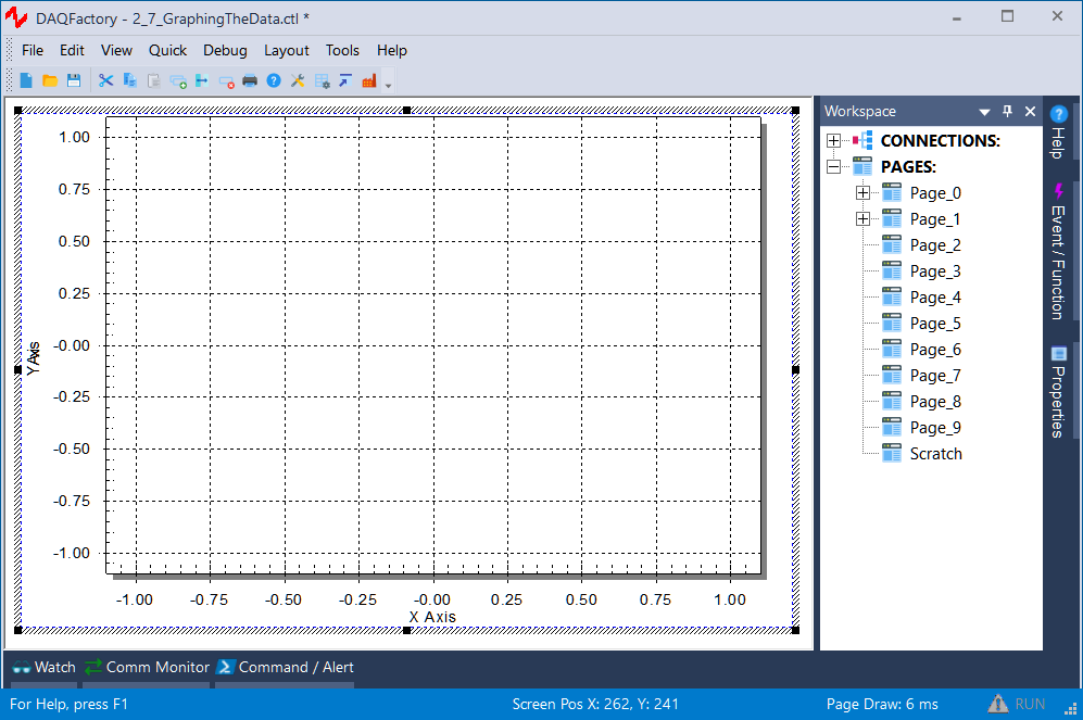
2. Right click somewhere on the blank page and select Graphs & Trends - 2D Graph. Move and resize the graph so it takes up most of the screen.
To move the graph, simply Ctrl-Click and drag. To resize, Ctrl-Click and drag one of the 8 dark squares around the outside of the graph.
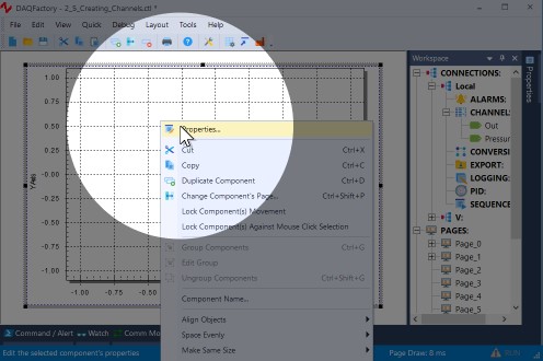
3. Next, open the properties window for the graph.
In case you forgot, simply right click on the graph and select Properties... The graph, along with the other components under Graphs & Trends and the Data Table component, have properties windows that are different than the other controls to allow for their unique features.
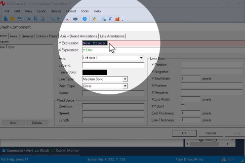
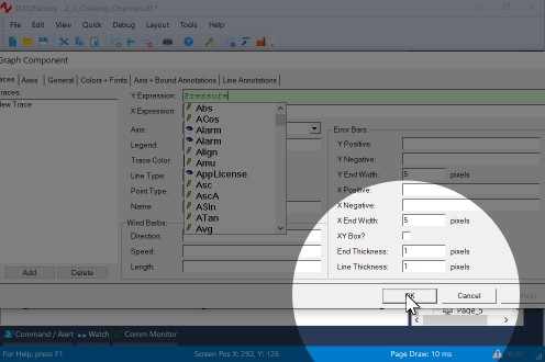
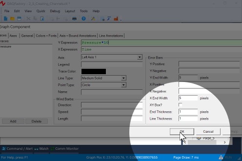
4. Next to Y Expression: type Pressure.
The Y expression is an expression just like the others we have seen so far. The difference is that a graph expects a list (or array) of values to plot, where in the previous components we have only wanted the most recent value. By simply naming the channel in the Y expression and not putting a [0] after it, we are telling the graph we want the entire history of values stored in memory for the channel. The history length, which determines how many values are kept in memory and therefore how far back in time we can plot is one of the parameters of each channel that we left in its default setting of 3600.
4. Leave all the rest in their default settings and click OK.
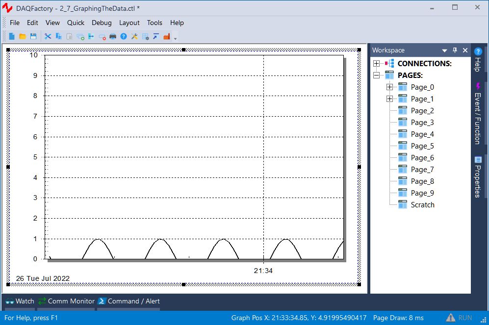
You should now see the top half of a sine wave displayed in the graph. The sine wave will move from right to left as more data is acquired for the pressure channel. To display the entire sine wave, we need to change the Y axis scaling.
5. Double click on the left axis of the graph. In this case you do not need to hold the Ctrl key.
Unlike other components, you can double click on different areas of the graph to open the properties window for the graph to different pages. Double clicking on the left axis brings up the axis page with the left axis selected.
6. Next to Scale From enter -1, next to Scale To enter 1, then click OK.
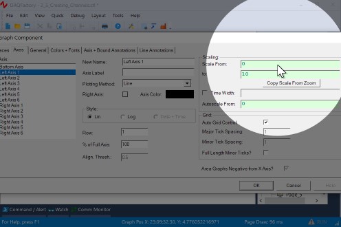
This will scale the graph from -1 to 1 which will show the entire graph.

Now we'll try another method to scale the graph.
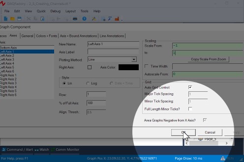
7. Open the graph properties box again and go to the Traces page. Change the Y Expression to Pressure * 10 and hit OK.
Like the other screen components, the expressions in graphs can be calculations as well as simple channels. In this case, we are multiplying each of the values of Pressure's history by 10 and plotting them. Since our range is -1 to 1, the graph will only display part of the sine wave.
8. Deselect the graph by clicking on the page outside of the graph. The shaded rectangle should disappear. Next, right click on the graph and select AutoScale - Y Axis
The graph component has two different right click popup menus. When selected, it displays the same popup menu as the rest of the components. When it is unselected, it displays a completely different popup for manipulating the special features of the graph.
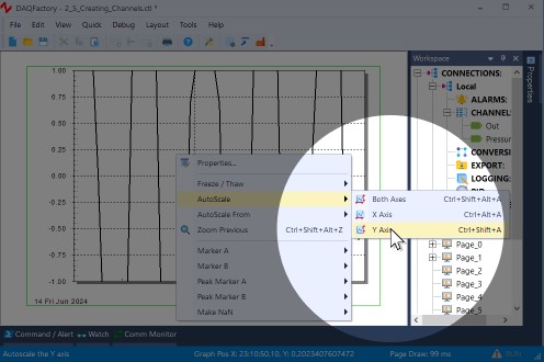
After autoscaling, you should see the graph properly scaled from -10 to 10. Notice the rectangle around the graph. The left and right sides are green, while the top and bottom are purple. The purple lines indicate that the Y axis of the graph is "frozen". A frozen axis ignores the scaling parameters set in the properties window (like we did in step 6 above) and uses the scaling from an autoscale, pan, or zoom.
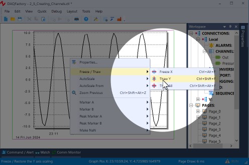
9. To "thaw" the frozen axis, right click on the graph and select Freeze/Thaw - Thaw Y Axis
Once thawed, the graph will revert to the -1 to 1 scaling indicated in the properties box and the box surrounding the graph will be drawn entirely in green.
10. Double click on the bottom axis to open the properties to the axis page with the bottom axis selected. Next to Time Width:, enter 120 and hit OK.
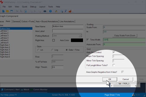
If the double click method does not work, you can always open the properties window for the graph using normal methods, select the Axes page and click on Bottom Axis.
In a vs. time graph, the bottom axis does not have a fixed scale. It changes as new data comes in so that the new data always appears at the very right of the graph. The time width parameter determines how far back in time from the most recent data point is displayed. By changing it from the default 60 to 120 we have told the graph to plot the last 2 minutes of data.
Once again, if you zoom, autoscale, or pan the graph along the x axis, it will freeze the x axis and the graph will no longer update with newly acquired values. You must then thaw the axis to have the graph display a marching trace as normal.

For more information on graphs and the many ways you can display your data in graph form, go to the chapter entitled Graphing and Trending.