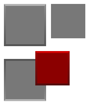
The panel displays a simple block of color with an optional raised or lowered edge. Like most components, the panel can be made clickable using the OnLButtonUp event. For fancier panels, for example with rounded corners or other borders, consider using a text component with no text.

Properties:
Format:
BackMultiBrush, BackMultiPreset, BackBrush, BackBrushPreset: determine the color of the panel. Please see sections 7.4.2 and 7.4.3 for details on Multi- properties and presets.
BorderWidth: the border size in pixels. Set to 0 to eliminate the border. Note that in this control, the border can only be a raised or lowered type. For other border types and options, use a text component with no text.
Raised: if true the border is drawn to make the panel look "raised" out of the screen. Otherwise it makes the panel look sunken into the screen.
Common Properties:
This component includes all the common properties of components described in section 7.4.4 but not the background properties.